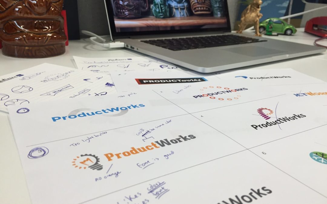
Logo design is one of my favorite types of projects to work on, but they can also be very challenging. A logo is the first impression for a company. It needs to reflect the client’s business. It needs to be clear and understandable. And it needs to work at varying sizes on varying applications. So there is a lot riding on my shoulders! Here is a peek into my logo design process.
Design Brief with the Client
When starting on a logo design project, first and foremost I need to know what the client wants. During the client meeting, I take the time to listen and ask questions to understand the mission of the company. I find out what they have in mind for the design, as well as for other logos that they like, colors they like and types of fonts that they prefer. And if there are any branding standards already in place that I need to work with.
Research & Reference
From what I learned in the design brief, I do more research on the client’s audience and industry. Knowing the audience and the industry and how their business fits in it is just as important as knowing what the client wants.
I first write out a list of words and synonyms that describe the company. This process helps me spark some ideas. I also use this to help find reference images. I find imagery and logos of similar companies using a Google Image Search, which also helps me make sure to avoid clichés and copyright issues. I gather all this into virtual mood boards, which isn’t as exciting as it sounds, it’s typically just a folder on my computer with the items and ideas I have collected.
For additional inspiration, I keep a couple of the LogoLounge books at my desk. These books are a great source for well designed logos.
Sketching & Conceptualizing
After I feel that I have collected enough ideas, then I start by making some quick sketches. First I try working with the initial letters of the name of the company and see how they interact with each other. I then also play around with iconic elements associated with that line of business, working them in with the name of the company. One of the main things I take into consideration when designing a logo is proportion and symmetry, I want the logo to feel balanced in shape, text, and color.
After I feel that I have some solid concepts, I move to the computer. I start by selecting fonts that have a look and feel that fits with the company and the sketches I have created. DaFont.com and AbstractFonts.com are good sites to search for original and unique typefaces. For more established fonts I will use Type Kit and Google Fonts, which are also web friendly fonts. I will type out the name of the company in lowercase as well as all caps, this helps me visualize which fonts fit where. If you want to know more about fonts, graphic designer Will Paterson has a great video to help understand the differences and uses of typefaces.
As the concepts begin to come together, I start thinking of the colors I want to use in the designs. If it’s more of a conservative professional company I might lean towards more neutral colors like blues and grays. If I have a little more freedom with the logo then I will try brighter colors like oranges and purples. As i’m doing this i’m constantly taking into consideration how the colors interact with each other, their hue, tone, and saturation. Often I will use the ColourLovers website to help select color palettes, the tool lets you search for user created color palettes based on hues and keywords.
Something that can be often overlooked in choosing colors are Pantone colors. If a client wants their final logo to be in Pantone, it’s important to start thinking about that as soon as you begin putting colors in the logo. It can be difficult to find a Pantone color that perfectly matches a CMYK color if you’re having to go back after you’ve already assigned CMYK colors to a logo design.
Revisions & Reflection
Personally, I think It’s good to step out and get away from the project from time to time, because inspiration can come from anything and anywhere, a poster on the street, a tv commercial, a beer bottle label. After some meditation and time away from the project, I go back and revisit the logos again, revising anything that I’ve found doesn’t quite fit with the vision of the company and ensuring the logos are ready for presenting.
Presentation
When I am designing websites for a client I usually only provide two to three designs, but since a logo is such an important part of the company’s identity, I will present up to six to nine logo designs. Sometimes not all the logos are fully fine-tuned but I include them because there might be some aspect of a design that the client might like and can be developed further. After the first time a client sees the logos i’ve been working on, I help the client narrow down the design. This continues to happen until the client is happy with the final logo. Usually there are two to three rounds of revisions to help polish up the final logo.
Delivery & Support
For delivery I will export the logo in various vector and raster file formats as well as various sizes so that the client has filetype for any situation they might need. Of course I’m always available for that time when there is a certain file or change that is needed.
Does your company need a new logo?
In the image at the top of this post you can see some sketches and concepts for a recent logo design for ProductWorks. Below is the final design.


